Juxtaposition Explored in Illustration
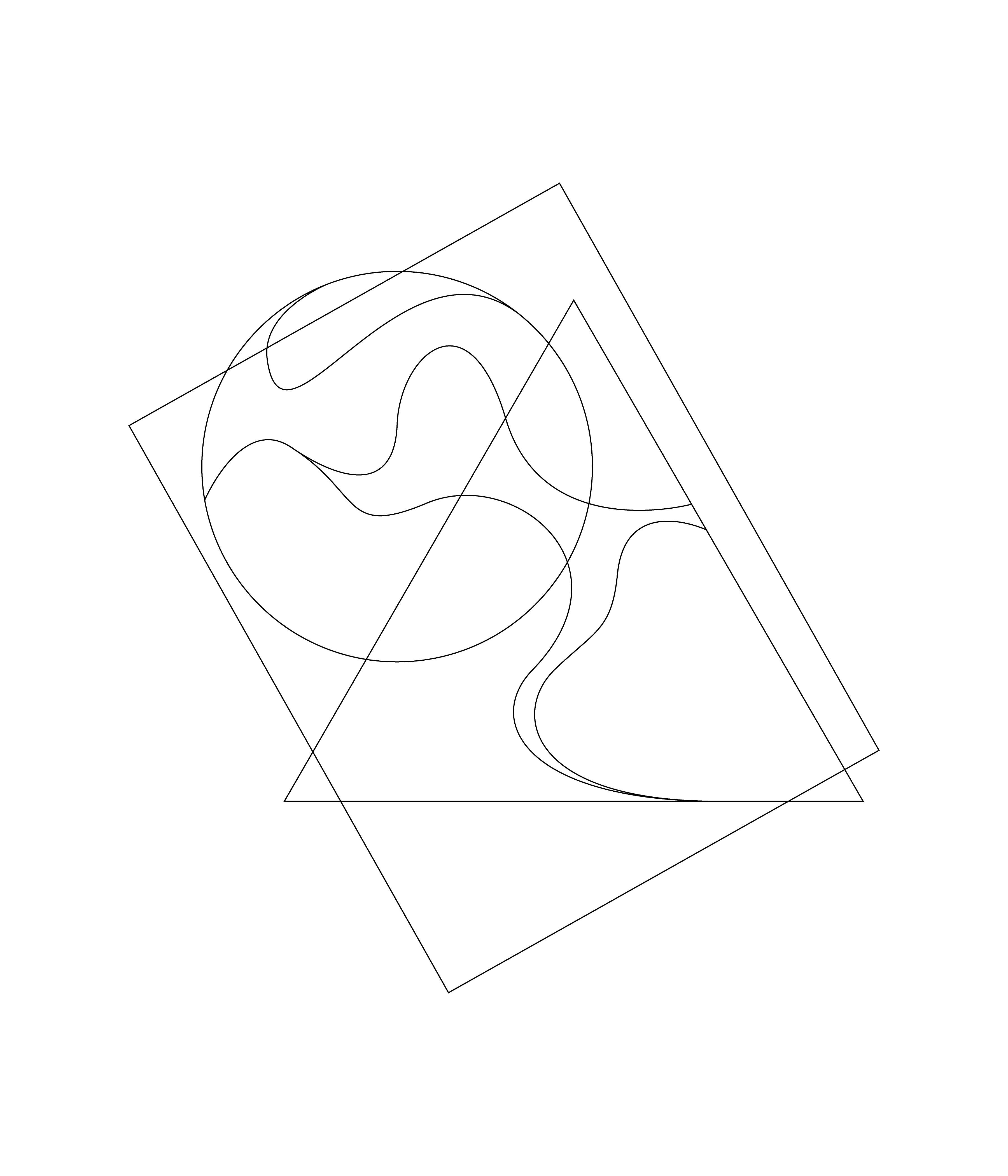
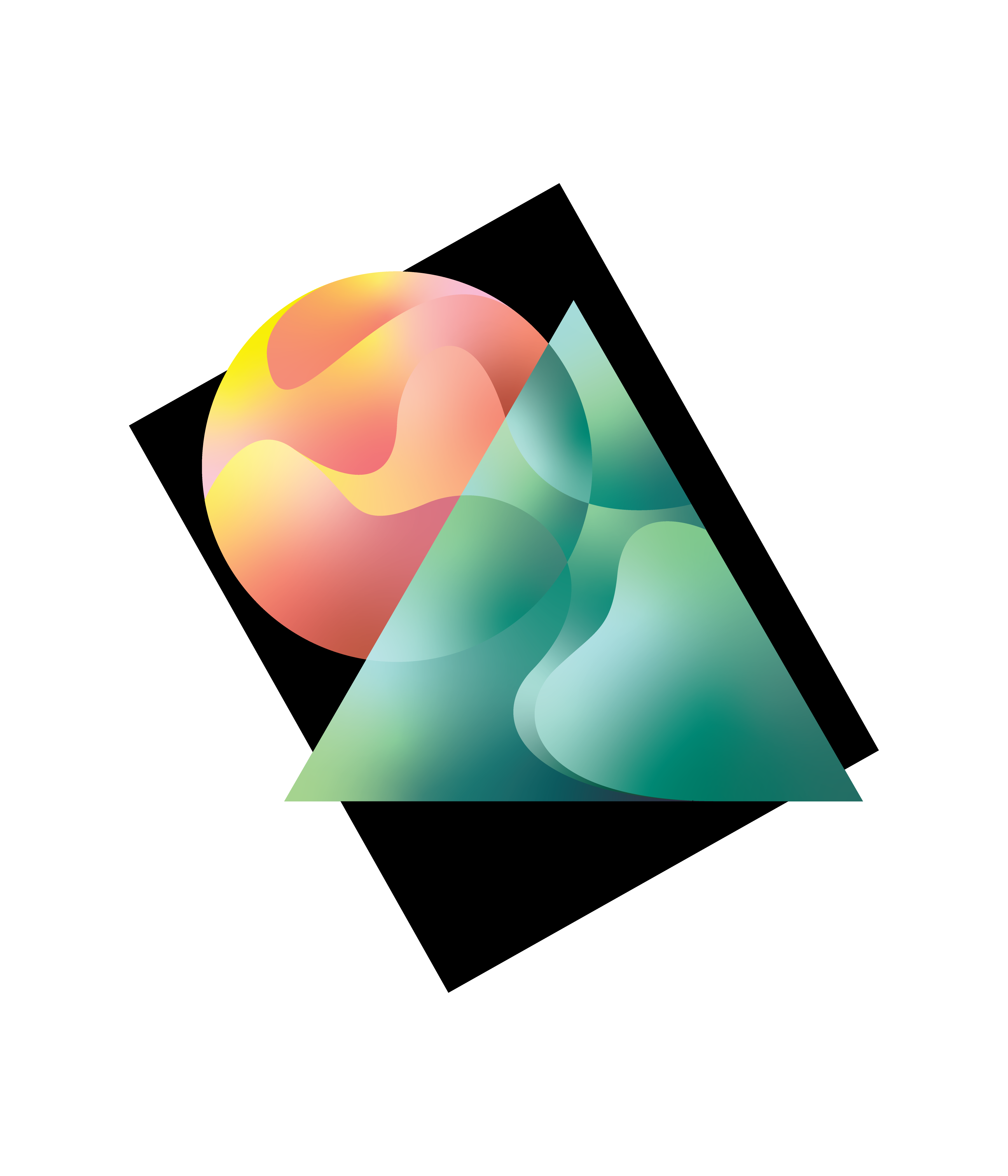
In this experiment, I explore creating visual, symbolic, and figurative juxtaposition in two-dimensional illustration. I offer two pieces. Looking at just the linework, organic lines create irregular shapes that contrast with the regular polygons that bound them. The first piece uses this to show the juxtaposition of forms in nature, wherein primary shapes often provide a basis for organic patterns to form within. Circular heavenly bodies contain vast swathes of colors that sweep across; triangular mountains give way to brushes of foliage. Symbolically there is a simple juxtaposition: the sun represented by the circle, and the earth by the triangle. Moving into color, a simple contrasting white background with a black backdrop, and a struggle between warm and cool colors. Shape outlines overlap, yet the colors communicate that the “mountain” is still in front of the “sun”. The overlapping shapes draw attention to the high contrast and stark line between the two palettes. Rather than blocks of color, the flat shapes are filled with complex gradients to create a sense of depth, highlight, and shadow, as an added element of contrast. This effect is achieved by strategically placing the darkest and lightest swatches of the palettes. Placement of the swatches in the gradients also helps to heighten the juxtaposition between the “sun” and the “mountain” along the masking line.
“Sun, Earth, Space”
In the second piece, I strive for more figurative meaning. Here I address a juxtaposition and confliction in the “wokeness” of American corporations, signified by Nike’s “swoosh”. On one hand, Nike can be a refreshing voice for social justice among corporations, standing with Black America in its famous ad campaign with Colin Kapernick, and releasing lines of LGBTQ Pride inspired clothing and shoes each Pride Month. On the other hand, they answer to Beijing during the continued protests in Hong Kong, pulling NBA merchandise in China after the team owner tweets support for Hong Kong, and shoes after designers have done the same, and recently an abuse problem on its highly-prestigious women’s running team was brought to light. The green circle a “go” light for “two steps forward”, and the red octagon a stop-sign for “two steps back”. The swoosh is filled in with gray gradients, symbolizing the gray-area or neutrality of ethics Nike inhabits. The rough infinity sign formed by the curving lines sweeping and intersecting between the shapes represents this repeating behavior.
“Two Steps Forward, Two Steps Back”