
By Mireia Montes Quiles
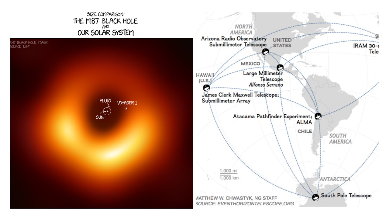
Astronomers have captured the first image ever of a black hole. As part of the Event Horizon Telescope (EHT) project, the team simultaneously took observations using telescopes around the globe to take one of the most detailed images ever of a black hole 55 million light-years away from us.
What is all this fuss about?
A collaboration of more than 200 scientists have taken the very FIRST IMAGE of a black hole! This is an incredible achievement and it is technically amazing; they used 8 telescopes observing at the same time…

Wait… what is a black hole, again?
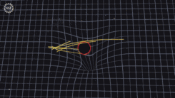
A black hole is a region of space where the gravitational field is so intense that no matter or radiation can escape. The center of the black hole, the singularity, is a point in spacetime that contains ALL the mass of the black hole; where the density is infinite. The gravity that this singularity produces is so strong that there is a region where not even light can escape. The edge of it, the point of no return, is called the event horizon. Like the telescope! Exactly.
Aaah! Got it. Can you explain this image to me? Why does it look like an orange donut?
Actually, we are not seeing the black hole because no light can escape from it.
An active black hole, like this one, has an accretion disk: a disk of gas and dust surrounding and feeding it. The friction heats this gas to temperatures of billions of degrees and consequently it glows. The path of this light is affected by the strong gravity of the black hole, bending it if it passes nearby. This is what creates the ring of light in the image. If too close, photons (light) are then trapped in orbits around the black hole, and eventually will fall into it. This region of photon orbits is the famous shadow of the black hole, 2.5 time larger than the event horizon, the hole of the donut.
The colour just represents how intense the emission of light is, brighter at the bottom because the black hole is spinning**.
How did they take this image?
The image has been taken in radio wavelengths, the ones used by radios in the past! Astronomers can take these radio waves and use a technique called interferometry to combine the information from different telescopes. This technique uses the separation between the telescopes to simulate a telescope of the size of this separation. For these observations, they used EIGHT telescopes around the globe, which means that it was basically a telescope the SIZE OF THE EARTH!
Why do we need such a big telescope?
Because we want to take such a detailed picture that we could see objects of the size of the solar system in a galaxy 55 million light-years away. To give you an idea of the detail we need, what we are seeing in this picture is the size of an orange on the moon. What?? Crazy.
Why is this image so important?
Apart from the fact that this is a technical success, with this image we are able to tell that Einstein’s theory of General Relativity accurately predicts what happens in these regions of such strong gravity. The theory predicts that the structure is nearly circular, which is what we have seen.

*Or a thousand times more massive than Sagittarius A*, the black hole of our galaxy.
** This effect is called relativistic or Doppler beaming. It tells us the direction where the black hole is spinning: clockwise in the sky.
Follow Mireia on Twitter

 If you go to twitter, you can see that #dataHackEd was trending just a couple of weeks ago. But what does dataHackEd even mean? What was all the buzz? It may be helpful to start with a definition of hacking: “Computer hacking refers to the practice of modifying or altering computer software and hardware to accomplish a goal that is considered to be outside of the creator’s original objective.” (definition from