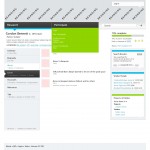
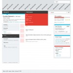
This is our current take on colours – it injects two secondary colours which makes the mono a bit brighter without confusing the eye as much as the teal/orange version.
Keep in mind that the block of red /green (see image) will normally be mostly hidden – this much colour is only while looking at the sub menus.


Comments are closed or deactivated
first impression. no 2! I think we are getting close!
I do have some issues with the layout of this page ( but I know we are not commenting- so I wont)
I think the bold lines of colour work. aesthetically and to reinforce the navigation. I prefer the light blue/blood orangish contrast.
The cutting up of the grey with the colour lines really brightens and freshens. its friendly and efficient. I’ll look again in the morning (i’m keen to see a front page in 2) but night eyes say 2.
exciting!
( a morning update- yakking to Ross last night- of course he loooves the lime!) hehe..
I love the hints of colour. They really cut through that (possibly intimidating?) black menu bar.
It’s a tough choice between the apple green version and the blood orange, but I do find the green a bit more calming.
Beautiful!
ooh! the bright colours are certainly arresting!
Just a thought – I’m finding it tricky to decide on look and feel without the branding there, unless the plan is to develop the foundation for the branding from these discussions on look and feel?
My intention re: brand is two fold: 1) The product of the DAAO (apart from relationships) is a website. That being the case I think its appropriate to get the website right and have that lead the brand. 2) Brand has just as many interested parties and is likely to be a more contentious process of decision making. That would hold up the website design process to a point that it could seriously affect the site launch date.
yeap i think we are on a winner here. Re the branding thing, because of our super fast timeline- we had to prioritise ‘treatment’ before logo. ( critical path issues) I say logo- bx you are right all of these discussions we have been having about groovy gravitas, reputable but inclusive, friendly and collaborative have all been affectual discussions around personality and brand.
hah! snow onec again we are snapping in mid cyber air!