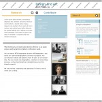
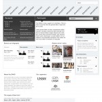
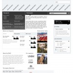
Two directions for the look and feel. Note : we’re not looking at content or layout – just look and feel ( colours, line weights, treatment ). We’re calling these `social` and `mono`.
Design look and feel – the two ways of life.
Posted by snow on Thursday, November 25th 2010
Categorized in Uncategorized
Recent Posts
Archives
Tags
-
agile art history Australian Art Australian art history Bernard Smith bookmarking collaboration community conferences consultation Content contribute Craft crowdsourcing data Datamanagement datamigration design diagrams digitalHumanities feedback Feminism fun import library look&feel maps metadata new media art obituaries office party matching projects research schema scholarship social media Sydney Biennale University of Melbourne Special Collections Collaboration user experience Visualisation visualization WA whiteboard youtube
WP Cumulus Flash tag cloud by Roy Tanck and Luke Morton requires Flash Player 9 or better.


Comments are closed or deactivated
my immediate response is for the second look and feel- mono. I like its minimalism and cleaness. It’s serious and cool. However, I agree ( with something you said in the meeting) that it may need a bit of softening up. ( either through edge softening or colour) I also like its weight and lines, my eye track across the dark contrasts and are led to ‘places’ where key bits of information can be deposited.
I also like ‘social’ but its ‘airier’- different blocks of colour pull the attention all over the place. It’s harder to prioritise and guide information weight.
but I am so pleased with the direction.
oh hai! Great options to choose from – social is certainly friendlier with the big rounded fonts and almost pastel shades. The little icons are more obvious in this design, and I much prefer the treatment of images here – small multiples in a line, (grey border is nice!) compared to mono’s different sized and captioned images. However, these colours approach cityrail and telstra colour branding, although i do like the gradations of blue and orange. I feel like i could jump right in and see how I could be contributing. Very positive feel.
Also, it took me a while to work out the magnifying glass and + icon relationship. Is the former is a link to more research and the + is for more contribute/participate?
Mono – I agree with Gillian, mono is more serious, certainly conveys the gravitas of scholarly research, the feel of the menu bar is elegant and polished, however this might be a bit intimidating? Assigning colour to “research” is tricky – eg, Mendeley has done pretty well with a reddy-brown & silver. I’m not too keen on the collection of supporter logos in the middle of the page – with the different sized images it looks a bit messy.
I’m assuming the black translucent box under ‘research’ is a dropdown which appears on mouseover? I like tidy features like this. Eg, I prefer the alignment of research, participate and search in mono rather than the slightly offset search function in social. And the stylized speech bubbles with triangles are great for indicating activity and participation, as well as drawing the eye towards the right column.
So.. i’m sitting on the fence with this one!
I’m beginning to fence sit a bit more too. … But on another tack. We have now put a third option, in which in an attempt to make the layout of images cleaner- we have cropped the image thumbs of artist’s work so that they fit the same orientation and shape in a box. How do yo artists out there feel about that? We’re conducting a straw poll on facebook and twitter ( where DAAO has lots of artist friends), but if you are’nit in these networks and have an opinion. shoot me an email and give us yr opinion. G.fuller [at]unsw.edu.au
I must say that intuitively I like the first one, and after thinking about the three, have worked out why:
The colours are more or less opposites. That means in setting up the page it is easier to carry through a theme orange= active participant blue = passive, reading and using, not creative. Yin and Yang, which is a great design principle. The impression is of two sections: the detailed account and the side bar. Very clean but still approachable.
The single grey-scale black is too harsh and not especially user friendly. It means the colour images leap out to much.
My eyes aren’t so great so I’ll often reset my computer to enlarge the font. On multi-columned sites this can be a total pain. But of course many users are in laptop, iPad or iPhone land.
All of them are great in that give a sense of something that is happening but not yet complete, which means we are encouraging potential users to join the community.
It’d make things easier if one of them was bad, wouldn’t it?
Initially my preference was Social – the layout is clear and almost calming. The colours tell me exactly where I need to go. It also says ‘large institution’ to me, perhaps because it is a little more conservative than mono.
The longer I look, though, the more I am drawn to Mono. It feels more dynamic and active. I expect that contributions I make to DAAO content will end up featured on the this home page, whereas Social feels a bit more controlled and static to me. I agree with Liz that this layout has gravitas, but it is also cool. A good balance I think.
I’d be interested in seeing a little bit of colour introduced to Mono to signpost different areas of the site.
Also agree that the logos could be shifted from centre stage.
Re the image cropping issue. As an artist I don’t think I’d have an issue with this. Thumbnails are meant to lead us to the larger image, a cropped teaser is no insult.
Oh I like em both!
I like in the first that the research/contribute are distinguished by color. I think that’d help a lot throughout the page.
And I like the style of the second. Which feels a bit more modern, and like it would hold up longer..
BTW I think the cropping is no issue. When you get to the artwork record you’ll see the full picture. And the squares will be a lot easier to design with!
ps I do like the little pies!
oh lotte, you’re making me hungry!
I was just having a conversation with Zina about reputation online and design elements, and we got onto personality as a key area of web design. We often use personality to describe how a person works, thinks and interacts with other people and in various social situations, and reputation is often linked to personality. Likewise in web design, different look and feel treatments have different personalities – compare eBay to the National Gallery of Australia. Or NGA to the MCA. All 3 have widely diverse audiences, but the online auction house eBay has a very different character to the hipster-magnet MCA.
Paying attention to personality helps to focus the visual impression of the resource under redesign. If these designs were people, what sort of personalities would they have? Does that accurately describe the mental model of the redesigned daao?