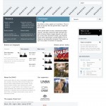
Here is a pass at integrating the two looks — social and mono. What we’re preferring is the `social gravity` look which looses the orange and moves the mono grey into a cool muted naval colour. It’s a little too close to UNSW blue possibly.
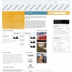
Also included is an experiment where we just rolled the social colours over the mono look — it’s called `Social plus`.
Feedback is, as usual, welcomed.


Comments are closed or deactivated
my first impression was social plus! I didn’t want to to click on mono as it looked a bit dour. Without the flash of red from the artwork thumbnail ( whch would randomly change) the treatment would be pretty grim.
looking at social plus, now i can appreciate more the value of the complementary colour coding of research and participate.
I agree that introducing some real colour contrast into social gravity- t soften and brighten it.
I’ll look again in the am with morning eyes! thanks snow.
I’m flicking between screens of the old Mono 2, Social plus and Social gravity and I think I’m really still drawn to Mono2!
While I love the liveliness of the Social Plus but my eyes ignore the text in the research drop down – not enough contrast between the background and the text to pull me in. The teal in both Social gravity and Social plus feels a bit corporate when compared to the coolness of Mono 2.
What is clear to me is that the layout works, I love it. I think it’s just a matter of finding the sweet spot with the colours… perhaps something a little sharper (??).