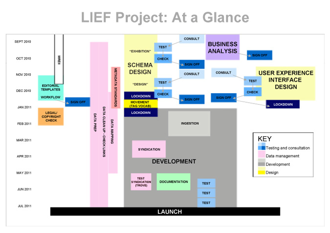
This diagram represents an overview of the schedule, major components and milestones of the Project. It is a gantt chart in box form. As the project progresses, various little elements will change within it as we learn more – but the critical path should not change.
Project Map: at a glance 1.0
- Comments Off on Project Map: at a glance 1.0
- Email to friend
- Stay updated
THATCamp Canberra
THATcamp Canberra is now finished, I’ve learnt so much in the past two days that it would take three days to write a coherent report. No time for that at present, so for now I’ll just list in a random way the things I got from ThatCamp. There is the twitterfeed #thatcamp for more extensive documentation.
1. a network of like minded people working on related projects. Some session felt like the best kind of masterclass. Very intense and very focussed.
2. the opportunities of variabilities of crowdsourcing, and how important a good work flow design is for users. Best example i can think of is the NLA’s australia newspaper project http://trove.nla.gov.au/newspaper
3. I finally understand how semantic web and ontologies work!
4. networks, networks, networks… same as 1. but i need to reiterate how important meeting your institutional peers in an informal context is.
5. persistent URLS!
added: Trackability of record is vital for DAAO. It is also interesting when thought of in a critical cultural light. The politics of identity and the persistence of identity as it relates to data and how that might relate to other politics of identity is a fascinating case study in metastability. ( I wonder if someone has done it?)
6. so many useful links for existing projects that have tools that we want – no need for wheel reinvention. The DAAO’s delicious tags tell the story. Look in the right column of this blog and click on DAAO delicious feed if you want to see more.
7. good citation information- the better you identify something, the easier it is to draw it back in. A repeat of No 5. But this is becoming a key issue for us in DAAO – as we have ambiguous information in our collections and artworks fields.
8. layers- safe layers and layer that users can play with.
9. Learnt more on dealing with Legacy issues, extensibility and transition paths.
10. A summation by another THAtcamp participant http://rearleft.wordpress.com/2010/08/27/mo66g33k/
more whiteboard adventures
This week Olivia and I have been focusing on the schema changes we need to implement in order to capture additional information on Exhibitions. We have been analysing Jonathan Holmes’ wonderful Art@Base exhibitions database, which, as well as providing much needed content, has provided a very useful model for an expanded exhibitions field structure.
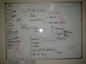
We have also been using some initial User Scenarios (developed in my early scoping of the project) and actual CI research projects to develop benchmarks. We do this by mining your research proposals to elicit the series of queries that would satisfy the informational demands of your project. The diagram below represents the beginning of mapping such benchmarks. The project that we were scribbling about below has 6 major types of queries for the DAAO, i.e. report relationship between curators and exhibitions, or report relationship between exhibitions with X heritage values. At the moment the DAAO can only respond to 3 of the 6 type queries and it could not display the relationships between variables in a comprehensible way. Thus at the end of the project, we would expect the DAAO to answer all six questions and display results in meaningful and variable ways. So the more information we get about your research proposals, the better we can design how the new data we are incorporating can be organised.
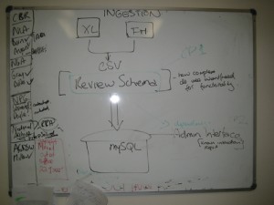
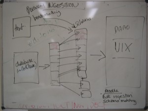
We have also started thinking about the processes of ingestion as new high quality research data appear out of dark to find a new home in the DAAO. In order for data to be ingested, we have to match the tables of different databases. Simply put, we need to lay out all the tables side by side in an excel document, compare the field structures and their naming conventions and then co-ordinate and systematise a matching of their structures. The diagram below came out of discussion I had with David Turnbull (Manager, Web and Innovation, UNSW), where we were talking about the process of an an ingestion module and how it interacts with the critical path of our project.
David is on our Technical Steering Committee, and he is one of many people around here that always has some time to explain and clarify technical issues. Another is the patient and sensible Laszlo Gercsov, UNSW Digital Library’s Systems Architect. We are very lucky to have such clever and helpful people around.
The word of this week is LEGACY, which sounds ok until you match it with the word ISSUES. Another of the helpful clever people around here at UNSW is CSE’s Daniel Woo. I’ve known Daniel’s work for years, but he has just finished managing a database project, and his calm words had the hard edge of fresh experience behind them. LEGACY ISSUES, he said. Ah yes. Migration path. On the list for next week.
- Comments Off on more whiteboard adventures
- Email to friend
- Stay updated
This week in whiteboard
Many of the most illuminating discussions i have with people on any project is over diagrams. When someone makes that box connect to that circle via an arrow (or better yet, a dotted line), that is usually when the penny drops for me.
Here are a few of the scribbles that facilitated conversation this week.
The diagram above was used for thinking through the critical path for ingestion new data into DAAO and how it impacts on schema design.
This is what this diagram currently means to me. Our designers and I will be working with CIs (you, imagined reader) to find out how an improved database website will best serve your research needs. Your answers input into modifying the schema design and also guide the design of the website through which you experience the database. Meanwhile, Olivia and her editorial/indexing team will mine print new source texts for ingestion – indexing to the new schema. While Olivia (she’s busy!), the designers and I also go through the new databases, (such as art@base) that we are ingesting and interoperating with (Fuam), and matching and modifying when necessary non-aligned schema. The next iteration of this diagram should have arrows all folding through these boxes in feedback loops – but the green pen died.
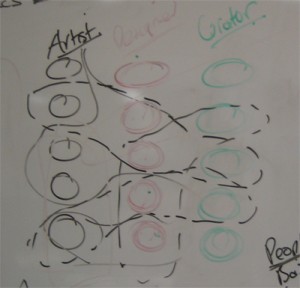
Ross and I were using this twister diagram to talk through how various filters might work to capture new imagined relationships across expanded ‘people’ set. – like artist-curator-designer/design organisation. (There is another re-conceptualisation of ‘organisations’ diagram coming)
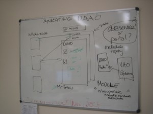
This diagram emerged after a very interesting discussion with Mr Snow and Zina from the House of Laudanum – where we discussed metadata registry as way of thinking through ‘truth problem’ with interoperating databases – like Video Art Online (VAO) and DAAO.
There are so many things going in this project: ingesting, connecting, interoperating, reducing ambiguity, enhancing search, standardising, redesigning user experience AND then opening up our data into the miasma of the dataverse so it will be safe in numbers but simultaneously pulling it back again as something defined and redefined.
One of the most personally exciting things about this initial business analysis stage is gaining a really solid sense of the dynamism and complexity of the landscape in which the DAAO needs to live if it is to survive. There is so much bending and breaking of things to make things fit and yet there is a drift and flow. At once mechanical and organic, the dataverse is a fascinating place at the moment. New vocabularies emerge every other days to describe the growing, living, dead and dying worlds of data.
This week’s word is agile. (Well it been the word for a while) But as i try and work through critical paths of this project, it is clear that feedback across multiple processes makes linear process difficult. The need to be agile runs from product to process and back.
- Comments Off on This week in whiteboard
- Email to friend
- Stay updated
Recent Posts
Archives
Tags
-
agile art history Australian Art Australian art history Bernard Smith bookmarking collaboration community conferences consultation Content contribute Craft crowdsourcing data Datamanagement datamigration design diagrams digitalHumanities feedback Feminism fun import library look&feel maps metadata new media art obituaries office party matching projects research schema scholarship social media Sydney Biennale University of Melbourne Special Collections Collaboration user experience Visualisation visualization WA whiteboard youtube
WP Cumulus Flash tag cloud by Roy Tanck and Luke Morton requires Flash Player 9 or better.

