Sorry I haven’t posted for a while. What with data migration, site building, interoperability negotiations and stitching up our next LIE, blogging became priority c 😉
quick update;
data migration is more or less complete. We are just mainly ‘cleaning up’ now. Data Migration would have to be one of the most intense work experiences i’ve ever known. You learn so much about your data and all the really grunty bits of data organisation. Huge learning curve for all of us and tremendously exciting- but also exhausting. I imagine Liz will post on the process sooner or later. ( She’s been quite heroic! – We love our data dudes at the DAAO!)
site building : we are working with editing interface now- bells and whistles are being attached each day. Alastair from IxC, (our developers) is an island of calm in an sea of activity tickets that fly around in the online project management system. All appears to be happening more or less on time. all good there.
LIEF and interoperation: It is becoming apparent that we have a pressing need to develop some seriously efficient automated and semi-automated work flow tools for interoperating with large datasets. All the collections and research insitutions I have met get the usefulness of our project and how it will expose quality datasets to eachother. Consequently, everyone is signing on. I was in Melbourne last week and was overwhelmed with how many major resources there are in Melbourne alone. We will be working very closely with many Victorian research and collection institutions in the next round. Its is very exciting and will enhance our research capacity enormously.
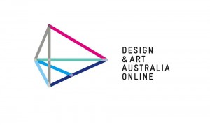
and finally! here are some identity concepts to comment on.
Both are still in development and both have been presented to Management Committee and DAAO production teams (last Friday). I won’t disclose our thoughts as yet, so as not to colour any opinions. Comments are open. let us know what you think.
CLICK ON IMAGES TO ENLARGE.
in context:


Comments are closed or deactivated
Well there’s no public chat – buts lots of emails and chats and the first option of logo + name rather than acronym logo has emerged as the one we are developing.
It has more potential for derivatives, animation and development. It works better in multiple contexts. Its deceptively recognisable, while being discomfortingly enigmatic- which in terms of branding is key. ( what makes a good brand may not be the same as what you’d hang in your home- think about how google’s brand has evolved!)
we are now working on extending and refining the colour palette of logo and site and doing a bit more on typography.
I’ll post up some more pics as we develop a bit more.
I prefer the first logo to the second: there’s more colour, more energy. And it has a more memorable gestalt.
That said, I think both logos have a bit of deja vu: I can imagine the effort that has gone into their creation, but am concerned they may not carry enough sense of discovery and delight that worked well with the coloured pixels logo.
Inevitably there will be disagreement about branding – personal taste, preference and response inevitably colour judgement. I was interested to read Catherine’s response, because my instant reaction was to prefer the second logo. The first gave me a sense of insubstantiality; it looked like a student project. I liked the solidity of the second. That said, I’ll paint my walls at home any colour I like, but at work I’m resolved to give my opinion, but give most weight to the opinion of design professionals. Like Catherine I loved the pixels.
I prefer the first one
whilst as Catherine said neither of them perhaps are fully forward looking – the first one has far more going for it – I think it actually looks more professional – less likely to date – more flexible – and it speaks to “design” in a very broad context even to architecture and I think that you can do more with this logo
it has spatiality and volume which is often an issue that designers feels distinguishes design activities from fine arts
sorry Margy
to me the second one looked far more “studenty”, clunky, obvious and fixed and seemed to have a “statute of limitations” – either of time and fashion or of flexibility and adaptability already foxed in place
welcome to the blog! how wonderful to have some of Investigators and partners here!
Margy, you won’t be surprised to hear that Andrew Wells also preferred the second one too. It resonates more with library, archiving, the shapes of books on shelves and ( also art in frames) . Indeed that was the designers inspiration for that one.
I do prefer the first one, for all the reason I stated in first comment. (And Juliette’s points resonate very strongly with me.)
But I also agree that its not quite there yet. The new typographic layout will help. I should have something more developed by monday , hopefully!